ColorEdge
- About UniColor Pro
- What is Color Universal Design?
- Color Universal Design Practice
- Simulating Color Blindness
About UniColor Pro

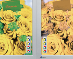
EIZO's UniColor Pro software simulates color blindness when used with select EIZO LCD monitors. It allows designers to see how their printed materials, signs, web contents, videos, etc. will appear to those with color blindness.
Color Universal Design Support
UniColor Pro supports color universal design by simulating color blindness in real time.
Not everybody views color in the same way. Certain colors are perceived differently by people with color blindness so it is important to take into account different types of color vision when choosing colors for any type of design. This is called "color universal design" and applies to the use of colors in newspapers and other printed materials, signs for public facilities, maps, and other mediums where color is used to convey information.
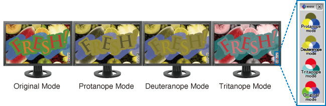
Color Vision Deficiency Simulation in Real Time
UniColor Pro and specific EIZO monitors present a hardware-based solution so they change how content is displayed on screen in real time without affecting the data itself. They simulate two types of red-green color vision deficiency (protanopia and deuteranopia) and one type of blue-yellow color deficiency (tritanopia). An EIZO-developed ASIC (application specific integrated circuit) inside the monitors does all the color conversion processing in real time - even moving and blinking images. With UniColor Pro software (compatible with Windows 7/Vista/XP/2000 and Mac OS X 10.3.9 or later only), you can instantly switch among four modes - Original, Protanopia, Deuteranopia, and Tritanopia. In addition, you can capture images and print them out for comparison.
In developing the monitors, EIZO worked closely with the non-profit Color Universal Design Organization (CUDO) based in Tokyo, Japan, to conduct experiments with colorblind test subjects to improve the ability to identify difficult to distinguish colors.

Hardware vs. Software Simulation
There are two ways to simulate colors. The first is to use software to perform image editing/manipulation on the data itself, and the second is to use hardware that changes how color appears on the monitor's screen.

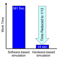
The main difference between these two methods is the amount of time required. In one experiment, the time needed to check the content of a web page about 11,000 pixels in length using software was 581 seconds. Using select EIZO FlexScan and ColorEdge monitors, a hardware solution, the same check took only 44 seconds or 1/13 the amount of time*.
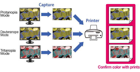
Screen Capture for Increased Efficiency
You can capture an image when any of UniColor Pro's simulation modes are active. You print them out and compare the differences.

Download UniColor Pro
You can capture an image when any of UniColor Pro's simulation modes are active. You print them out and compare the differences.
Notes on Simulations
The following points should be noted when using the monitors to view images converted through the simulation process.
(1) In the simulation of protanopes and deuteranopes, the vision of the most strongly affected people is reproduced. Approximately one third of colorblind people are estimated to be in this category. The remaining two thirds have their color vision somewhere between that and the common-type color vision, including those whose vision is very similar to the common-type vision. For this reason, please keep in mind that not all colorblind people, including those more weakly affected, have color vision as indicated in the converted images.
(2) When there is a color that is difficult to distinguish, people judge it by using information other than the actual color as a complement. For example, we view an apple as red and paper as white, even when both are lit in red under a red light. The same applies to colorblind people. For them, it is difficult to distinguish some tones of sky blue from some tones of pink. In this case, colorblind people view that the clothes worn by a man should be sky blue (even if pink), and those worn by a woman pink (even if sky blue). This happens because people judge colors by comparing them with their memories and experiences - men often wear sky blue while women wear pink.
In a color vision simulation, a range of colors that are difficult for colorblind people to distinguish are all converted into one color, which is determined by a calculation formula of the colorblind theory. Therefore, the color displayed is not necessarily the color recognized by colorblind people. For example, pink and sky blue, as described above, both appear as sky blue in simulations, but it is incorrect to think that "colorblind people see pink as sky blue."
Simulations do not show you "which color colorblind people see as a certain color." Therefore, they should only be used to understand "which colors on the screen are difficult for them to judge".
The above "Notes on Simulations" is excerpted from EIZO's "Color Universal Design Handbook" which is based on material issued by the Color Universal Design Organization (CUDO), a non-profit organization in Tokyo, Japan.
* 581 seconds was the time required to do screen captures and make image files (17 in total) for the entire web page, convert each image with the simulation software, and view the files. With the monitors, color conversion of the web page was instantaneous; 44 seconds was the time required to scroll down the web page after conversion. This example is meant to illustrate the practicality of the monitos compared to software solutions for high volume content that designers work with on a daily basis. It was taken from "Developing a Monitor for Checking Color Barrier-Free" from the collection of papers of the 31st Sensory Substitution Symposium held in Tokyo, Japan on December 5-6 2005.
What is Color Universal Design?
People see color with significant variations. In Japan, there are more than 5 million people in total who see color differently from ordinary people, due to their genetic types or eye diseases. Color Universal Design is a user-oriented design system, which has been developed in consideration of people with various types of color vision, to allow information to be accurately conveyed to as many individuals as possible.
3 (+1) Principles
- Choose color schemes that can be easily identified by people with all types of color vision, taking the actual lighting conditions and usage environment into account.
- Use not only different colors but also a combination of different shapes, positions, line types and coloring patterns, to ensure that information is conveyed to all users including those who cannot distinguish differences in color.
- Clearly state color names where users are expected to use color names in communication.
+1 Moreover, aim for visually friendly and beautiful designs.
Who is it for?
So-called "colorblind people" (also known as Daltonian, color-weak people, or people with color-vision defects, color-vision deficiencies, or dyschromatopsia) account for the largest proportion of those who have different color vision from ordinary people. In Europe and the US, one out of every 10-12 males and 200 females is believed to be colorblind1 , with a total of over 10 million in the US and around 2 million in the UK. In Japan, one out of every 20 males and 500 females is believed to be colorblind with a total of over 3 million nationwide2 . Globally, more than 200 million people are believed to be colorblind, and this figure is equivalent of the number of males with type AB blood. Colorblind people have normal eyesight (resolving power of the eye) and can also see small objects clearly. For some particular combinations of colors, however, they have different vision from the common-type vision.

In addition, there are several tens of thousands of people who cannot distinguish any colors and can tell differences in color only by their brightness or darkness. Most of these people also have weakened eyesight. Age-related illnesses such as glaucoma and cataract can affect how we see color as our eyesight weakens. In Japan, there are over 1.4 million cataract patients in total and approximately 5.6% of the population aged 65 or older suffers from the disease. As society ages, the number of such patients tends to increase. Furthermore, diseases such as diabetic retinopathy and retinitis pigmentosa can also weaken eyesight. A total of several hundreds of thousands of people are so-called "people with low vision3, with corrected vision of 0.05 or more and below 0.3 in both eyes, who require consideration for not only their weakened eyesight but also simulated views and degrees of contrast.
1 Reimchen, T.E. (1987) Human Color Vision Deficiencies and Atmospheric Twilight. Soc Biol, 34, 1-11
2 Ota, Y. and Shimizu, K. (1999) Shikikaku to Shikikaku Ijou [Normal and Defective Color Vision]. Tokyo. Kanehara Co., Ltd.
3 Based on the World Health Organization (WHO) definitions.
The above excerpt is from EIZO's "Color Universal Design Handbook" which is based on material issued by the Color Universal Design Organization (CUDO), a non-profit organization in Tokyo, Japan.
Color Universal Design in Practice
Why is Color Universal Design so important now?
In 21st century society, use of color is increasingly becoming an important means of information transmission. Several years ago, for example, black and white printing was the norm for newspapers, magazines, textbooks and general publications. But recent development of color printing technology has dramatically turned them into color. These days, even simple guide maps would look rather inadequate unless they were in color. Color has also been introduced to the operation screens of photocopiers, or mobile phones, automatic ticket-vending machines, automatic teller machines (ATMs), etc., and most such screens are now in color. The use of a variety of colors has also become the standard for electronic information boards. Electronic devices and home electric appliances used to have pilot lights with a simple on/off function, but they now commonly come with new types of lights which illuminate in a number of colors to convey information in various different ways. Color-coding is in place in public facilities, museums, exhibition sites, etc., where rooms and areas are divided according to theme colors and full of colorful information displays. At railway stations, train lines are color-coded for direction purposes; route maps and time tables are illustrated with lines and characters in a variety of colors.
As described above, there are so many more scenarios where color is a tool for conveying information, compared with one or two decades ago. However, many color displays are still designed with only common-type color vision in mind. As a result, there are more and more cases like the charging adapter shown in the photograph below, where the information provided is difficult for colorblind people to read, resulting in inconvenience to them. In our current society, life is ironically becoming even harder for the colorblind. Color Universal Design has been developed to resolve this major issue. Giving consideration to Color Universal Design allows you to use color effectively and create colorful designs that everyone will think beautiful, while still conveying information accurately.
Valuable to everyone regardless of color vision type
Color Universal Design is not a "peculiar design concept developed only for some colorblind people and rather difficult for people with common-type color vision to see". The purpose of designing with the colorblind in mind is to completely reexamine the existing inconsistent color-designing procedure that tends to increase the number of colors unnecessarily, establish an order of priority for information elements to be conveyed, and create designs that take into account the impressions and psychological effects they may give to the receiver of the information. Color Universal Design is focused on ease of use from the user's perspective, rather than only relying on the designer's aesthetic sense and sensitivity. This will result in "well organized easy-to-see designs" for people with the common-type color vision as well. Therefore, Color Universal Design is valuable not only to the colorblind but also to everyone.

"Color Barrier-free" - The trend of the times
Thoughtful use of color to ensure that the colorblind are not disadvantaged is called a "color barrier-free" presentation. Until recently, vision-related barrier-free activities were designed only in consideration of people who can hardly see. However, the importance of color barrier-free presentations is becoming increasingly recognized at a rapid pace. For example, both Section 508 of the Rehabilitation Act in the US, enacted in 1998, and Phase III of the Disability Discrimination Act in the UK, started from 2004, explicitly call for the consideration to people with disabilities including the colorblind among others.
Effective cases of Color Universal Design
| Public facilities | At public facilities such as hospitals and government offices, careful thought must be given to floor directories and warning signs, color schemes for application forms, electric displays in reception areas, color-coding for items to be handed over to the user of the facilities such as medicines, etc. At hospitals, in particular, extreme care must be taken as they are frequented by the elderly as well as eye patients. |
|---|---|
| Museums & exhibition sites | In addition to the above, attention must be paid to how to make descriptions of exhibits easy to understand. |
| Railway stations & airports | Consideration must be given to route maps and directional signs on platforms, electronic information boards to indicate departures and arrivals, etc. |
| Roads | Attention must be paid to road signs and color tones of lines painted on roads, electronic information boards that indicate road information such as traffic congestion, etc. |
| Schools & prep schools | Consideration must be given to the colors of chalk and marker pens, the selection of teaching materials, etc. |
| Newspapers, magazines, text books, reference books, operation manuals, PR magazines for local governments & companies | Careful thought must be given to font coloration, color schemes, line types and color-coding within descriptive figures and graphs, legend indication methods, etc. |
| Maps, route maps, guide maps, car navigation devices & globes | Attention must be paid to color schemes for color codes, line shapes, legend indication methods, etc. |
| Ticket-vending machines & ATMs | Consideration must be given to color schemes and designs of operation screens. |
| Electronic devices | Careful thought must be given to color schemes for charging lights in mobile phones and digital cameras as well as designs for their display screens. |
| Electronic office equipment | Consideration must be given to operation indicator lights and operation screens of photocopiers, fax machines, PCs, etc. |
| Home appliances | Consideration must be given to operation indicator lights of electric rice cookers, electric kettles, microwave ovens, etc. |
| Audiovisual equipment | Careful thought must be given to operation indicator lights and operation screens of TVs, VCRs, etc. |
| Cars | Consideration must be given to display colors on meters and to designs of operation panels. |
| Medicines | Attention must be paid to color-coded displays of medicine type and dose, particularly for those prescribed at hospitals and pharmacies. |
| Stationary | Consideration must be given to color schemes for color-coded filing products such as document folders and binders, ink colors of ball-pointed pens, as well as how to make it easier to distinguish one color tone from another for the colors used in 8 and 12 color sets of marker pens, colored pencils, crayons, paints, etc. The correct color name should also be clearly shown on each item. |
| Websites | Careful thought must be given to font coloration, color schemes for descriptive figures, and also the selection of background color. |
| PC software | Attention must be paid to how to display each type of screen. |
The above excerpt is from EIZO’s “Color Universal Design Handbook” which is based on material issued by the Color Universal Design Organization (CUDO), a non-profit organization in Tokyo, Japan.
Simulating Color Blindness
When used with specific EIZO LCD monitors, UniColor Pro simulates color blindness in real time. This applies to not only still, but also moving images and blinking text. UniColor Pro. The following videos demonstrate how UniColor Pro simulates two kinds of color blindness - protanopia and deuteranopia.
Please note that color is perceived by different people in different ways. These videos do not represent how all people with protanopia and deuteranopia see color.


